

Fabric Style Guide
Carpe Diem Beds' Fabric Style Guide is deeply rooted in the brand's Scandinavian heritage, drawing inspiration from the pristine landscapes of Sweden’s West Coast. This is at the base of our Style Philosophy, which can be tailored to reflect your personality and individual needs.
Our Fabric Selection features materials from renowned brands, crafted with exceptional attention to detail and designed to harmonise seamlessly with our beds, bedroom furniture, and accessories.
CLASSIC COLLECTION

Wool Light Grey

Wool Dark Grey

Wool Black
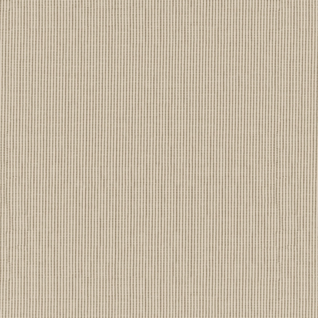
Wool Beige
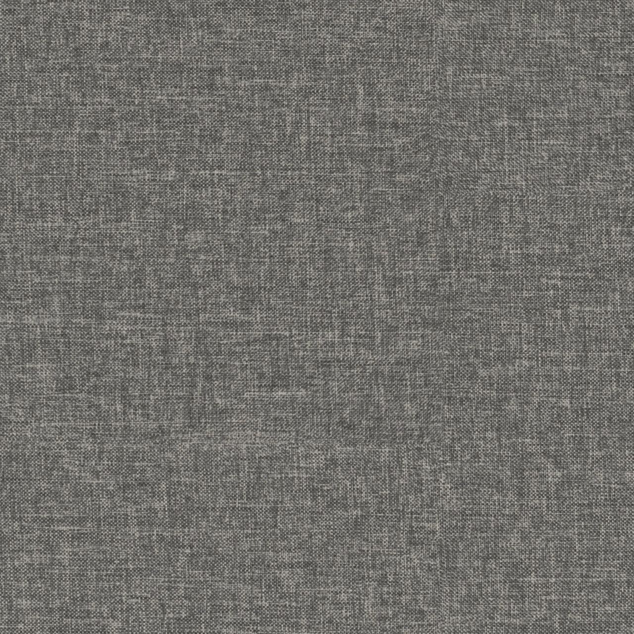
Luxury Light Grey

Luxury Dark Grey

Luxury Black
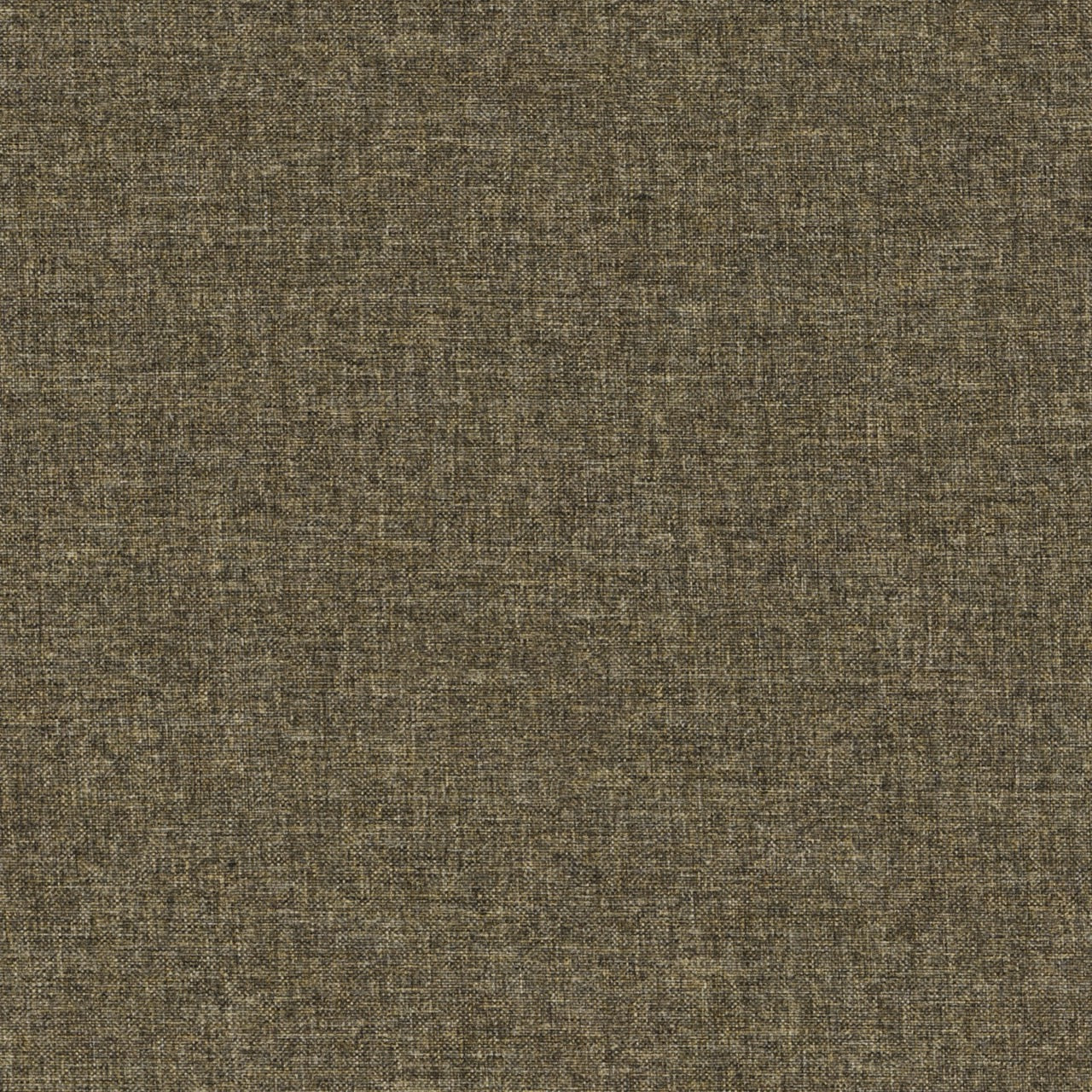
Luxury Sand

Dg Zaragoza Steel

Dg Zaragoza Pebble

Dg Zaragoza Eggshell

Cliff Light Grey

Dg Rothesay Graphite

Dg Rothesay Stone

Dg Rothesay Zinc

Dg Rothesay Pumice
EXCLUSIVE COLLECTION
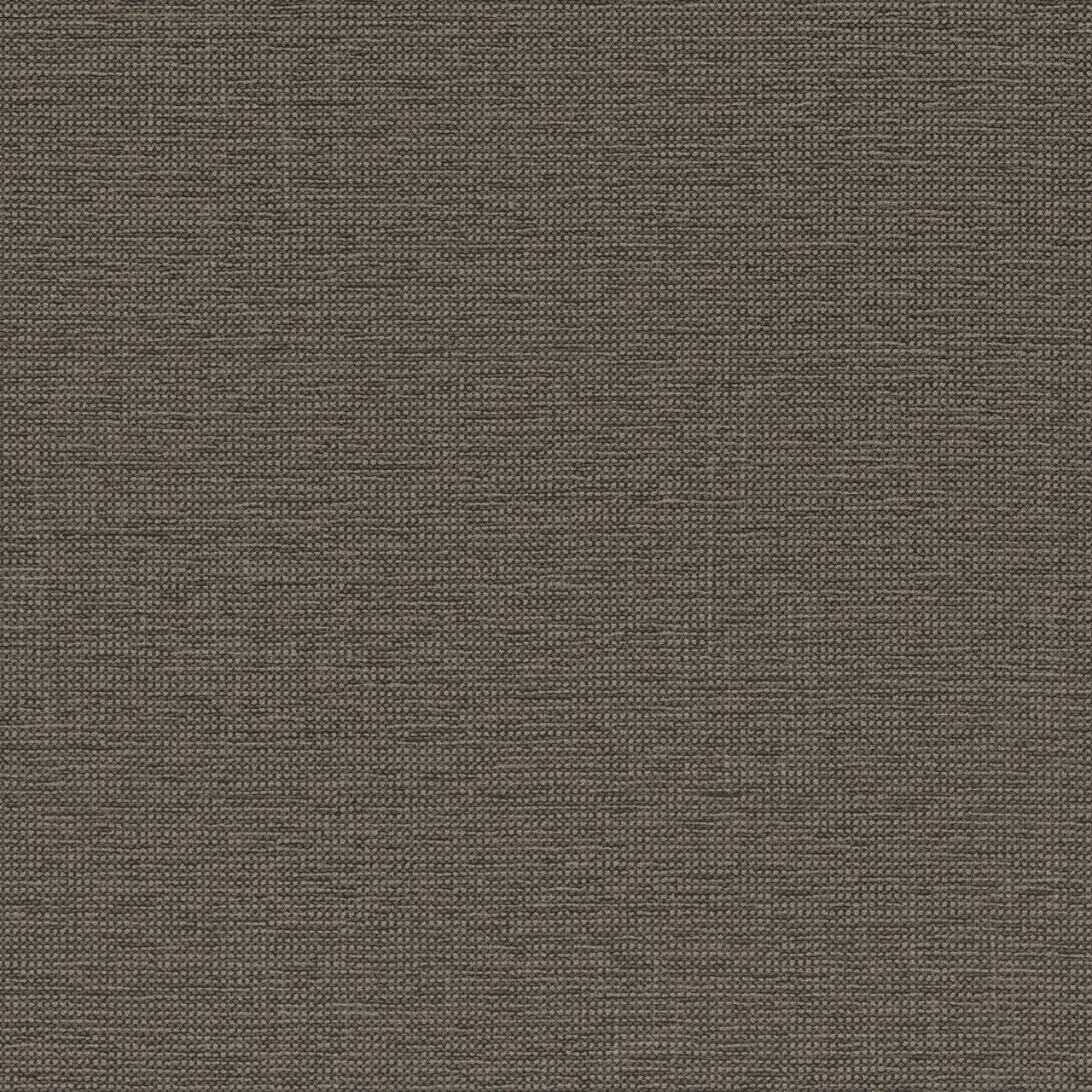
Ro Asuri Antler
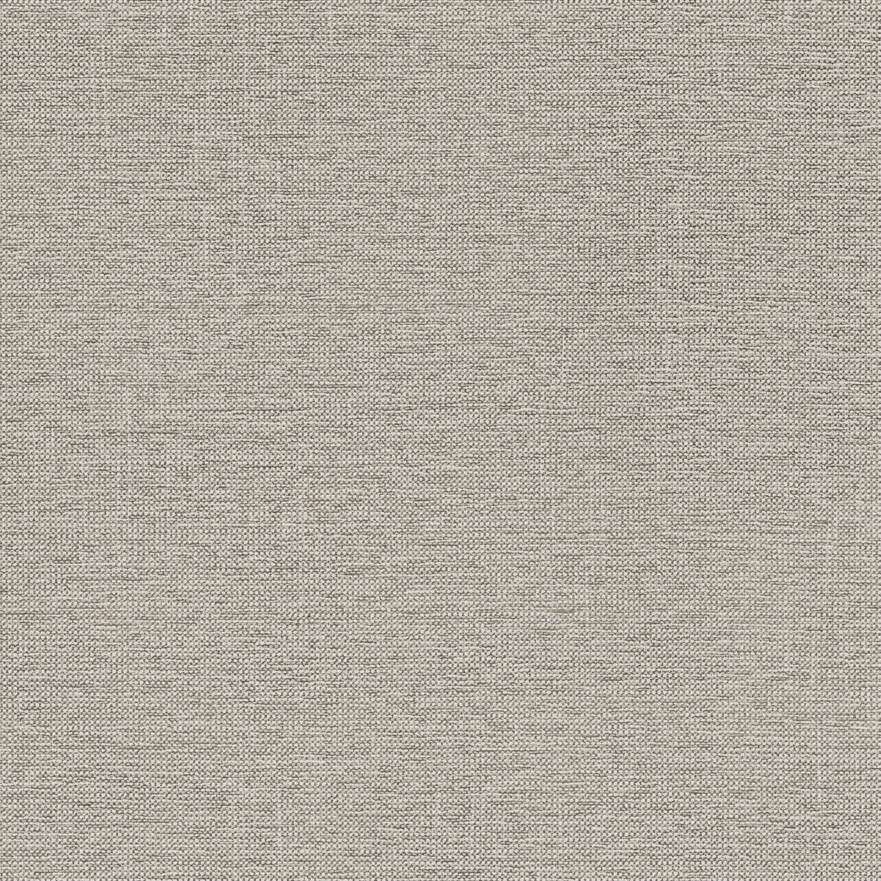
Ro Asuri Cashew
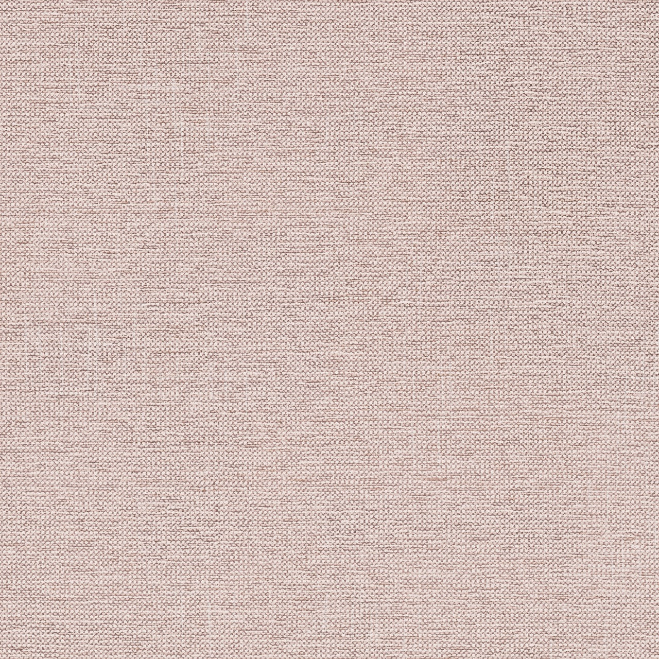
Ro Asuri Rose

Ro Asuri Mulberry

Ro Asuri Pigeon

Dg Glenville Celadon

Dg Glenville Granite

Dg Glenville Oyster

Dg Glenville Zinc
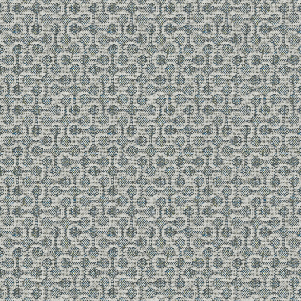
Dg Derwen Japanese Ink
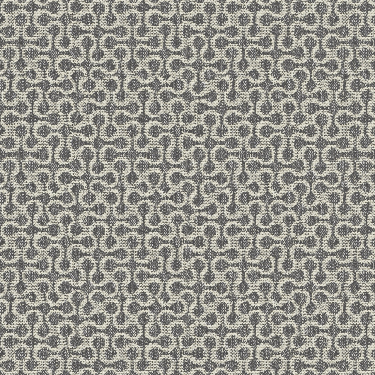
Dg Derwen Notting Hill Slate
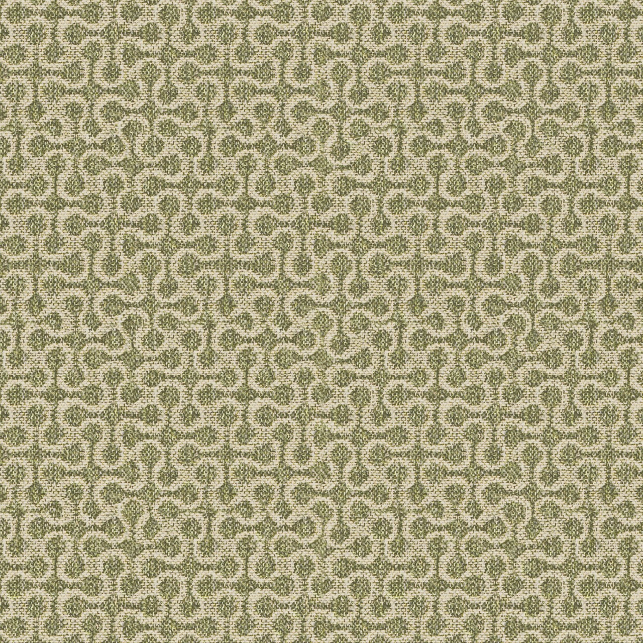
Dg Derwen Retro Olive

Ro Loop Evergreen

Ro Loop Marine
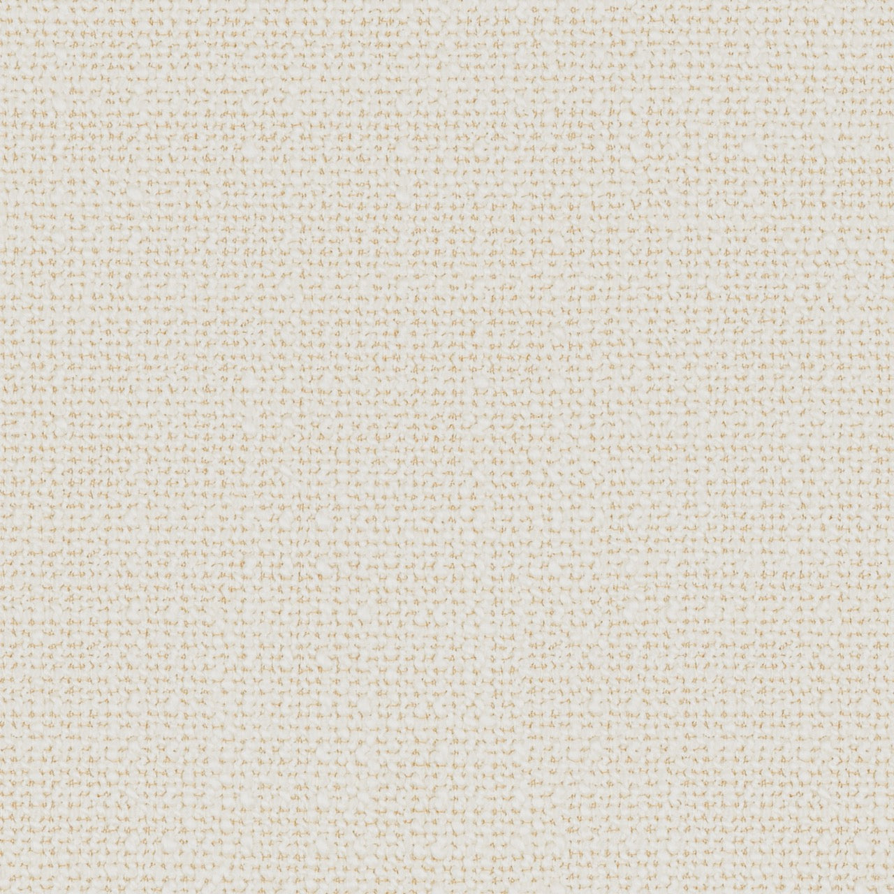
Ro Loop Oyster
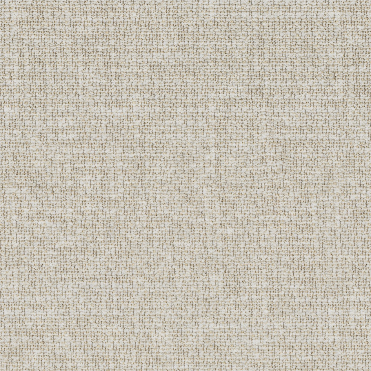
Ro Loop Stone
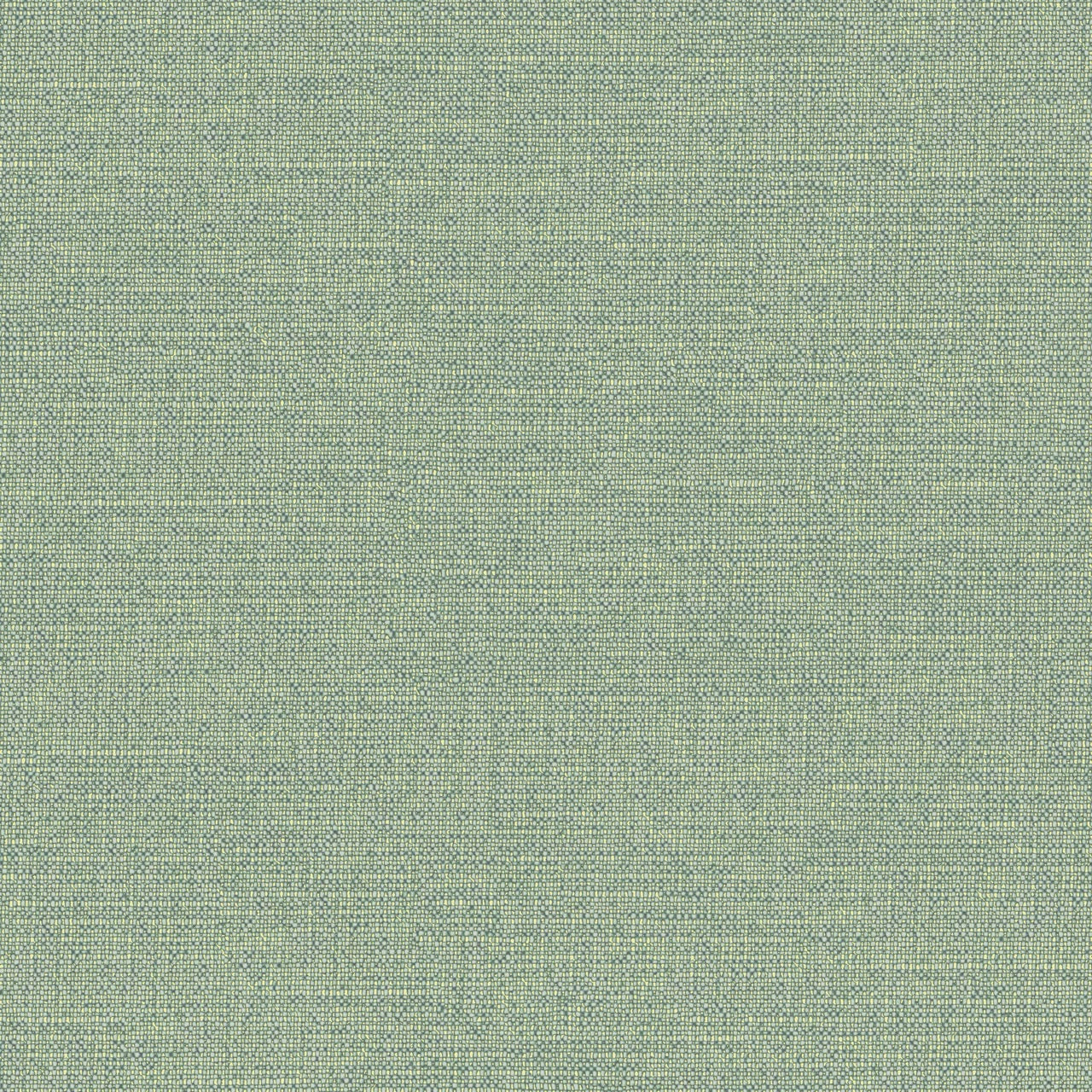
Dg Skye Aqua

Dg Skye Chalk

Dg Skye Midnight

Dg Skye Zinc

Dg Azuara Ecru

Dg Azuara Natural

Kv Fiord Beige

Kv Fiord Light Brown

Kv Fiord Dark Grey

Kv Melange Nap Dark Grey

Kv Melange Nap Beige
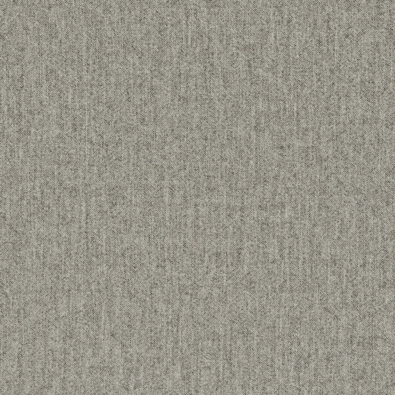
Kv Melange Nap Light Grey

Combining Fabrics
Combining different fabrics is an art form that can elevate a room from ordinary to extraordinary. By skillfully balancing harmony and contrast between various textiles, you can shape an atmosphere that reflects your personal style and taste.
This guide will help you gain a deeper understanding of how to use colour, patterns, and materials to achieve the perfect balance and create the look you envision. Read more.
Colour
The colour wheel is made up of 12 sections, divided into primary, secondary, and tertiary colours. The primary colours are red, blue, and yellow, while the secondary colours—orange, green, and purple—are created by mixing two primary colours. Tertiary colours, in turn, are formed by combining a primary colour with a secondary colour that sits next to it on the wheel.
Colour Psychology
Blue is often linked to calm, peace, and harmony, making it a popular choice for bedrooms due to its soothing effect. Darker shades of blue convey a sense of stability and trust, while lighter tones evoke freshness and relaxation.
Green, associated with nature, health, and well-being, is another calming colour that helps create a balanced and harmonious atmosphere. It’s frequently used in bedrooms to bring a feeling of freshness and tranquillity. Purple, on the other hand, is connected to mystery, creativity, and luxury. As a blend of red and blue, it inherits qualities from both colours, balancing energy with serenity. Read more.
MONOCHROMATIC COLOR SCHEME

ANALOGOUS COLOR SCHEME
ACCENT COLOURS / COMPLEMENTARY SCHEME

ACCENT COLOURS / COMPLEMENTARY SCHEME
PATTERNS

PATTERNS AND COLOUR
TACTILITY

THE INTERIOR DESIGNERS' CHOICE

THE INTERIOR DESIGNERS' CHOICE
MINIMALISTIC

MINIMALISTIC
